The composition of a photographic image is the author’s arrangement of elements within the image.
Photographically, composition is influenced by all aspect at the disposal of the photographer including: their position, framing of the image (both in camera and with subsequent cropping), and determining the zone of focus.
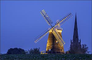
At the start of my 10,000 hour journey to become a better photographer, one area of weakness was (is) composition. My Thaxted Windmill and Church Spire apparently is “poorly composed.” In particular:
- Two elements of roughly equal significance
- Similar heights in the frame
The more I worked on this post, the more complicated it became. So I’m just going to give mention to a number of important areas with a view to returning to them in greater detail in follow-up posts.
This is a topic I hope to review regularly. If you have any comments on this post, please post them below.
To see more posts on other photographic topics, or to follow my learning progress, please like or follow me on the social media channel of your choice to the right.
Overall Objective of the Photograph
The objective of any photograph is to create an image that has some balance of the following characteristics:
- Informative – accurately recording an event
- Subjective – convey the author’s message or opinion intellectually
- Emotionally evocative – convey that message or opinion emotionally
- Aesthetically pleasing – create an image that is pleasurable to look at.
The importance of the above characteristics will change depending upon genre of photography or the particular image being shot. For example, reportage and wildlife photography places a high priority on accuracy. Creative and contemporary photography, by contract, is less prescriptive, and often more subjective and emotionally evocative.
However, any successful image should hold the attention of the viewer.
Basic Techniques
These are, as the Americans would say, the “Photography 101 Techniques.”
Fill the Frame
As large as possible
In general, and as a starting point, it makes sense to show the subject of the photograph in as much detail as possible. This means making it as large as possible. In fact, it is often possible to show just a section in detail to achieve greater impact. For example, rather than a standard head-shot portrait, just the face and part of the hair can be more interesting.
… but there are other considerations.
Deliberate Framing
A super bet peeve of mine is, other photographers (I use the term loosely) who cut your feet off when trying to take a full length or group shot. This is sloppy framing and the same principle applies to missing arms, or legs.
If you are not including all of element in an image, the cut-off is important and must be a deliberate decision. For example, people look good if you take head and shoulders, just a head, or even just their face and part of their hair. However, this must look like a purposeful crop, just missing the top of their head looks like an oversight.

Allow for Movement, Looking Space and Context
A running dog has to have somewhere to go; a person looking to the side has to have space to look into,and generally speaking, wildlife needs a some level of space around the subject to provide context.

One tip from Steve McCurry’s short YouTube “9 photo composition tips”, is to place what he refers to as the “dominant eye” exactly in the middle of the frame. The images above might have been better had I have been able to do this!
Dramatic Impact of Negative Space
Used with caution, a blank area of an image can emphasise and create drama around an element in the opposite side of the image.
Leading Lines
Apparently, people most usually start “reading an image” from the bottom left hand corner. A bold diagonal element in the image from the bottom left, to the center of the image is considered compositionally strong and is known as the “baroque diagonal” (as opposed to the “sinister diagonal”, which is bottom right to top left).
Molly Bang’s book “Picture This: How Pictures Work” is a playful description of how an arrangement simple elements can be used to create drama and mood in an image.
Rule of Thirds, and Variants Thereof
This is about positioning elements within the frame. Putting the horizon in a landscape half way down an image, or an object smack-in-the-middle can be dramatic, but more usually looks crass and simplistic.
Putting the horizon at either a third or two thirds down the image is generally considered to be most aesthetically pleasing. If one imagines lines dividing an image into thirds both horizontally and vertically, the four places where these lines intersect are the power points within the image where the eye naturally rests. Elements placed at these power points will have most prominence within an image.
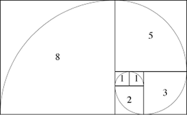
A variation/ refinement of the above is to replace the 1/3 division point with the golden ratio which is about 37% (vs 33% – in practice, not a big deal). This ratio occurs regularly in nature, was first discovered mathematically by Fibonnachi, was embraced by artists of the enlightenment such a Leonard da Vinci, and is much advocated for use in photography by Travis Leaf Glover and others.
Rule of Odd Numbers and Power Triangles
Generally speaking, an odd number of elements in an image is considered preferable to an even number.
Three elements arranged in a triangular formation is stronger than three arranged in a line, as the eye can move more freely between them.
People: Gestures and Faces
Explicit pointing or the direction of a person’s gaze can move the view’s eye around and image.
Role of the Background and Figure/ Ground Relationships
For any image the selection of background provides context, but is also a potential source of distraction. My working practice, at the time of writing this, is in all cases to keep the background as simple as possible, and clue to context as subtle as possible.
See principle 5 of Gestalt theory below.
Gestalt Theory – The Unified Whole
The unifying goal of gestalt psychology is how individual elements are perceived as a group. The particular principles are as follows:
- Similarity – when objects look similar to each other, the viewer will tend to:
- concentrate on the pattern or shape formed by the group
- be drawn to any object that is slightly different or out of alignment
- Continuation – how the eye prefers to see a single continuous figure than separate lines
- Closure – how the eye fills in the missing parts of a shape that it knows/ assumes are there but cannot see
- Proximity – shares that are close together are identified as a group and perceived as a single object
- Figure/ Ground – the eye’s tendency to separate objects from their background
- Symmetry and order – allows the viewer to concentrate on message rather than wasting time looking for missing elements.
Great reference: “The Designer’s Guide to Gestalt Theory” by Sam Hampton-Smith
Pattern, Structure and Narrative
In his book, “What is Art?”, John Canaday dedicates a chapter each to Composition as Pattern, Composition as Structure and Composition as Narrative.
Pattern
Pattern considers the aesthetics of the composition; how the image works as an abstract.
Principles that make an image visually engaging include:
- Repeating elements – recessional parallels
- Using different shapes and contrasting colours
- Odd number of elements, particularly three arranged in a triangle.
The acid test: flip the image upside-down, so that the elements in the image are no longer immediately recognisable, does the image still look good?
(Lightroom main menu: <Photo> “Flip Vertical”, is worth doing for all images, just to see!)
Structure
Structure is about how and image as a whole hangs together; its order, balance and symmetry. Again as an abstract,
There are a few principles (which rely on the techniques above for implementation) to control how the eye moves around and image:
- Placing the focus element on the intersection of thirds
- Arranging elements on a grid to achieve aesthetic appeal
- use of a vignette to retain attention within the image.
In his book “The Canon of Design”, Travis Leaf Glover makes much of dynamic symmetry both in classical painting and for photography.
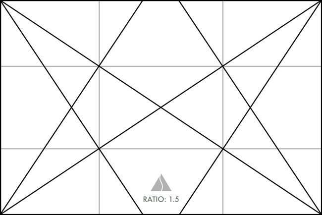
Image taken from Travis Leaf Glover’s post “Proof that Henri Cartier-Bresson used Dynamic Symmetry in Photography”
I’ve aways found this difficult to use in practice.
Lightroom tip: the crop tool will display a number of different grids, when active press “o” to cycle between these.
Narrative
In the context of the visual arts, narrative is about the intellectual and emotional communication of the image.
At the most basic level, decisions on what to include and what to exclude from an image define the scope of the story. Presentation of the dominant feature and its position relative to the other elements defines their relationships.
With people, gestures and faces can explicitly direct the viewer’s eye around an image to tell the story. Success of an image is often determined by the photographer having a clear idea of what they want, and arranging their subjects to achieve this prior to clicking the shutter.
Still Life Composition
Unlike many photographic situations, still life gives the absolute control over the selection and composition of elements in their image.
In a discussion with Rojer Weightman about still-life composition, he mentioned that the Dutch Vanitas paintings use objects symbolically to convey a message and comment on the meaning of life. In the case of Vanitas paintings the narrative is usually a reminder of the brevity of life and the worthlessness of material goods and pleasures. Rojer’s view was that such paintings include references to all five senses (taste, sight, touch, smell, and sound) and all four elements (earth, water, air and fire) arranged (in the terms of Canaday):
- Pattern: objects often arranged so as to harmonise adjacent or complementary colours
- Structurally: so that opposing elements, i.e., fire-water and earth-air are balanced on opposite sides of the image often laid out using the Fibbonacchi spiral as a framework
- Narratively to convey the required message, which is the case of Vanitas or Momento mori is usually to remind the viewer of the insignificance of their life and achievements in the context of the Christian interpretation of the big picture.
My working theory: photographers of all genres have much to learn from studying the practices of classical artists.
References and sources:
- “What is Art?” – John Canaday
- “The Canon of Design” – Travis Leaf Glover
- “Geometry of Design” – Kimberly Elam
- “Picture This, How Pictures Work” – Molly Bang
- “The Photographer’s Eye” (original, now superseded) & “The Photographer’s Mind” – Michael Freeman
This post was written whilst listening to Dvorak’s Slavonic Dances.