Photoshop’s route to more vibrant colours via an alternative colour space. This post looks at the Photoshop LAB colour space:
- how it mirrors the biology of human vision at a deeper level than the RGB of the retina’s cones
- how it can be effectively manipulated.
What is LAB Colour?
Photoshop supports various colour modes including:
- RGB – both Adobe RGB and the smaller, more practical and generally used sRGB. Most cameras capture images in RGB (either as RAW or JPEG). In nearly all circumstances sRGB is the colour space you need your resultant images in.
- LAB – the subject of this post – defines light in terms of:
- Luminosity,
- A Channel – Green-Magenta tint
- B Channel – Blue-Yellow hue.
- Multi-Channel – used only for very sophisticated/ specialist purposes such as satellite image interpretation, or output to non-standard devices.
Many photographers will never use anything other than an RGB colour space. Unlikely though it may seem at the moment, there is a case for LAB colour, please read on.
Add punch to an image
In my original workflow post “Post-Processing Workflow” (written in 2017 and now almost entirely superseded) “Step 10: Making the Colours Pop with Lab [Sic] Colour” used a Photoshop trick recommended by Scott Kelby to make the colours “pop”.
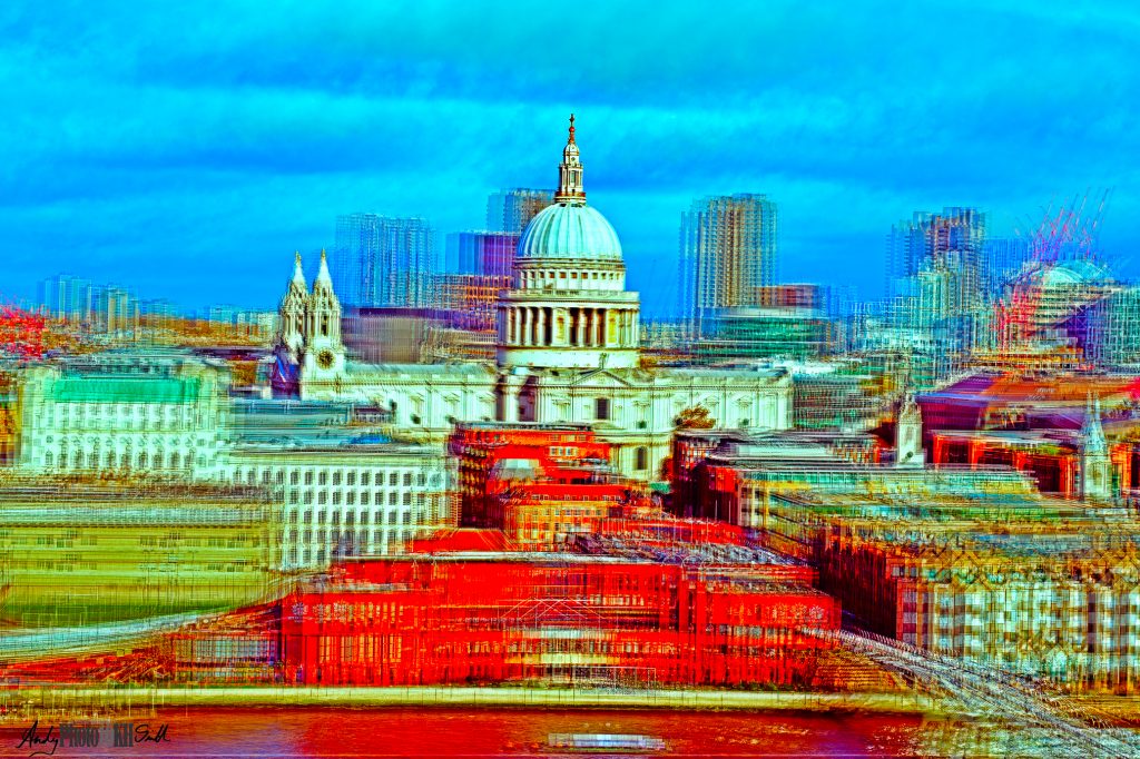
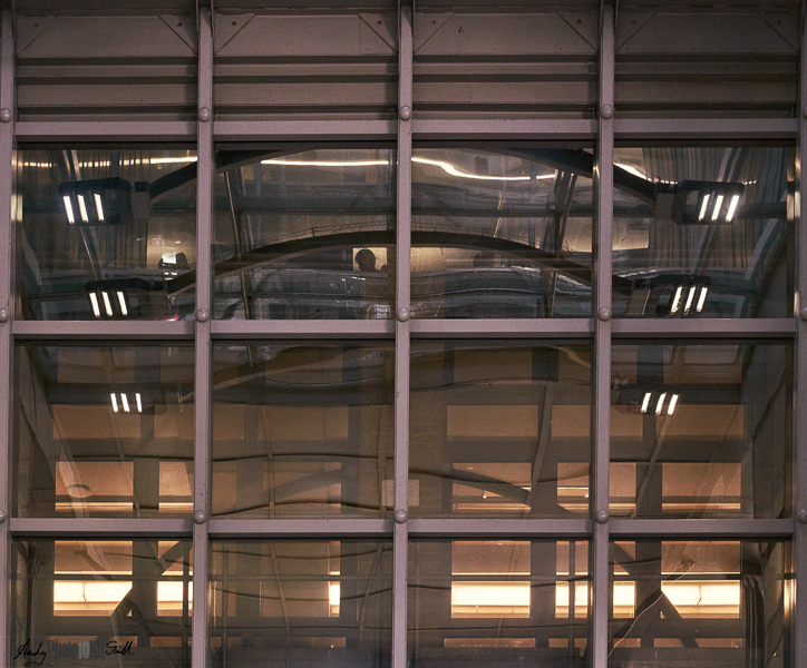
In Top-10 at Zero Hours
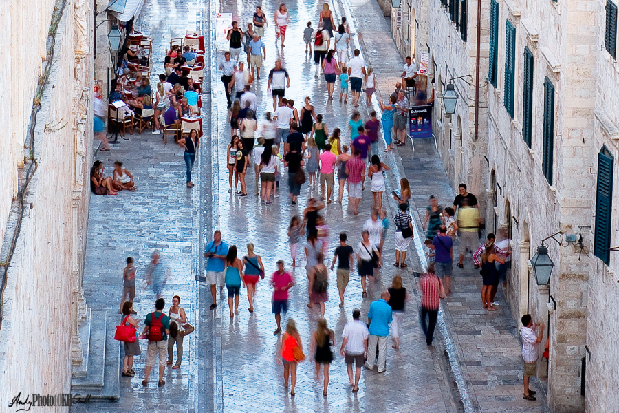
The above image did not do well with camera club judges, mainly because it lacked a single point of focus, “where the eye can rest.” However, I did, and still do, like it for its vibrant colours and the warm, relaxed feel of an early evening stroll in Dubrovnik.
Looking at the image analytically, it is clear that the colours have clumped together and there is very little variation in each of the oranges, pinks, magentas, blues, etc. Detail in the variation of hue has definitely been lost; look at all the yellows and notice how similar they are, ditto some of the blues.
However, the result is a simpler image with more impact.
The Science: RGB, LAB, and how we See
Warning: The world according to physics is a complicated place. Biology, including human anatomy, is not much easier as many models and processes at one level of abstraction are shown to be inaccurate when considered at a more detailed level, and there is much that we still do not understand. The physiology and psychology of vision is prime example of this emerging knowledge.
Therefore, the following is a simplification both bounded by my knowledge and contrived to suit my analogy with how Photoshop works.
The Real World
Light exists in a continuous range of hues across the visible part of the electromagnetic spectrum from infrared to ultraviolet.
:max_bytes(150000):strip_icc()/the-visible-light-spectrum-2699036_FINAL2-c0b0ee6f82764efdb62a1af9b9525050.png)
In the real world, a bit of red light and a bit of green light added together, may look yellow, but they do NOT magically average out their wavelengths to create yellow light. Instead they remain a bit of red light and a bit of green light. This can be proven by passing the mixed light through a prism where the constituent lights, of different wavelengths, will be separated out. By contrast, a pure yellow light passes through a prism as a single pure yellow light.
So why do we think red light + green light = yellow light? See below.
How we See: Part 1
Our eyes contain photoreceptors in the retina; rods, which detect light and dark across the visible spectrum, and three types of cone which are sensitive only to particular hues of light: Red, Green and Blue.
So a yellow light falling on a spot in the retina will activate:
- the rods in that area
- partly any red cones
- partly any green cones
- but will not stimulate blue cones.
Our brain then interpret this as yellow light. All colours are interpreted according to the diagram below.
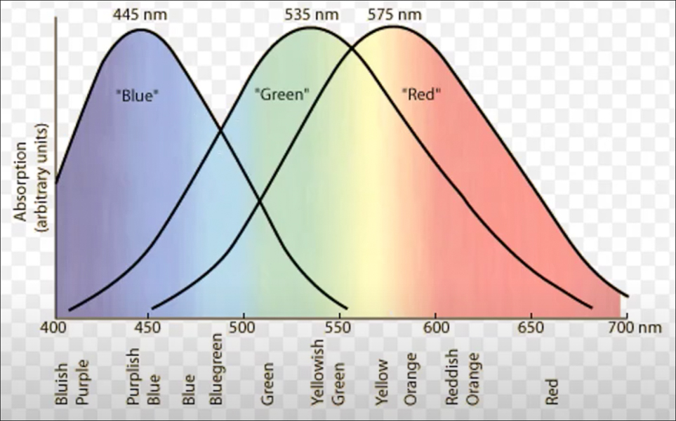
As a result of the above our brains cannot distinguish between pure yellow light and a mixture of a bit of red light and a bit of green light.
Digital cameras have separate red, green and blue (RGB) sensors for every pixel; digital TV screens and PC monitors emit RGB light at every pixel; and the combination fools us into thinking we are seeing the real thing.
(Young and Helmholtz, Trichromatic theory of colour vision).
How we See: Part 2
The brain does not see the world as a matrix of RGB pixels in the way a digital camera does.
The first step in interpreting the colours detected by the eye is performed by retinal ganglion cells (RGCs) sitting behind, and picking up signals from the rods and cones. The RGCs are a primitive form neuron with a long axion (“tail end”) that transmits the signal all the way to the midbrain which counter-intuitively is located at the back of the head. Collectively these axions form the optic nerve.
Amongst other roles, the ganglions convert an RGB signal from the photoreceptors into:
- Lightness
- Tint (magenta-green)
- Colour warmth (blue-yellow)
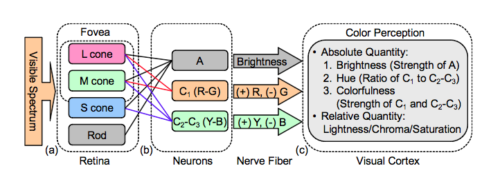
(Hering, Opponent Process Theory of Colour Vision).
Potential point of familiarity: colour warmth and tint are exactly the parameters we adjust when correcting the White Balance when processing a RAW file.
How we See: Part 3 – irrelevant but interesting diversion
This section has nothing to do with LAB colour; so from that perspective should not be included in this post. However, for the sake of completeness , I think it is important to mention the mental model.
When we consider any scene in front of us, be it a landscape we have been contemplating for hours or an image that’s just flashed up on our computer screen, we are not thinking about an image formed from the stimuli of our ganglion cells, but the visual model the brain has constructed. This model is based on:
- what the eye last saw (colour input from the eye is only from the central fovea, which is the size of the palm of one hand at arms length). So the eye needs to scoot about collecting colour information and other detail.
- what the brain expects to see. E.g., bananas are always yellow.
As a result we are easily fooled by optical illusions where the brain is wired to expect something different from reality. These anomalies tell us a lot about the deeper visual processing in the brain and presumably how such processes evolved by conferring on us a selective advantage.
Working with the LAB colour space
In its essence, working in the LAB colour mode means that one is able to separately manipulate tone and colour. See the following comparison:
- In the RGB colour mode, if one increases the Red channel, one increase both redness and luminosity (brightness) of that point
- In the LAB colour mode, if one increase the redness in the A channel, that point become more red whilst the overall luminosity remains constant.
LAB colour gives you more control, and for instance allows you to sharpen or increase contrast both in terms of luminosity and colour separation. Hence, potentially creating more impactful images.
My Workflow to Create Intense Colours
Changing colour space is NOT a non-destructive process: adjustment layers no longer make sense when the colour mode is changed, they are removed and their effect is lost. The way round this, of course, is either to flatten the image or, my preferred option, to create a new merged layer.
Looks a bit flat and too pink/ orange.
Using the top menu in Photoshop: Image -> Mode -> LAB Color
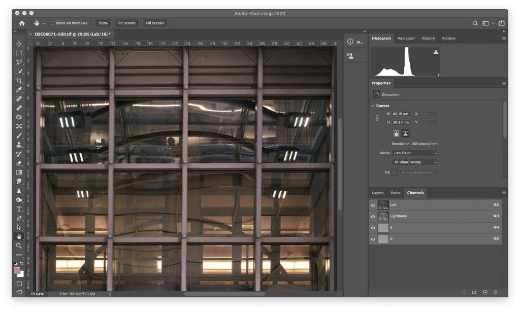
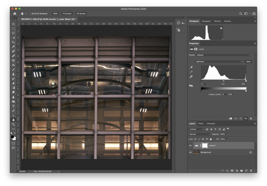
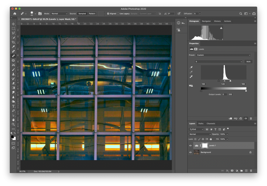
If we revert to the Layers tab, add a Levels adjustment layer and examine the Lightness channel we see the following:
The overall tone looks OK; good range all the way from fully black to fully white. No need to adjust.
Bringing the limits in, increases the contrast across the colour range without altering the tonality of the image
We can see already that increasing the contrast in the Green-Magenta colour range has increased the impact of this image.
More subtle adjustments are possible using the Curves adjustment layer across the 3 lab channels.
Comparison with Hue, Saturation and Luminosity (HSL)
RGB and HSL are different sets of numbers expressing the same thing. (In many ways like Cartesian coordinates vs Polar coordinates). To see this compare the following HSL colour wheel with the RGB Colour Space diagram in “How we See: Part 1” above.
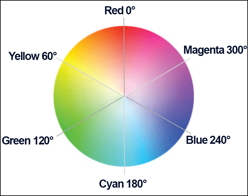
Hue: Number of degrees anticlockwise from Red at the top
Saturation: Distance from the centre
Luminosity: third dimension, how light or dark the colour is.
Graphics designers love the colour wheel and wax lyrical about complementary colours, etc. But if you think back to the Visible Spectrum shown at the start of this post, you may wonder “how on earth did we get here?”
Considering the above colour wheel it is easy to visualise how LAB colour provides a natural and controlled way to adjust saturation along the two dimensions our brains use.
To see that the adjustments I made above are not the same as just bumping up the saturation in the original image. I tried that below and got it as close as possible using just a Hue/Saturation adjustment in the RGB colour space.
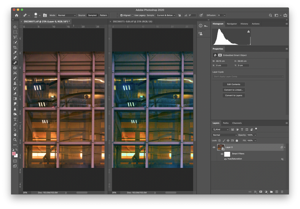
Although the two images above appear to have similar saturation levels the image to the right displays more extreme hue variation.
Final point
Images have to be converted back to RGB (usually sRGB) to create a JPEG for display or printing. This again is a destructive process where the effect of level or curve adjustments will be lost if the file is not flattened first.
References:
Extremely interesting article. Many thanks for composing.
My question concerns subjectivity. Is there information on how uniform is our perception of colour variables. Obviously colour blindness is a problem for some – is it the case that there is a spectrum (as it were) of more or less colour perception – perhaps indicating that only the creator of an image can completely appreciate the effect that they are trying to create? If this is the case can one allow for this ‘perception difference’ when finalising an image?
Hi Kevin,
Thank you for your kind comments.
Thank you also for your deceptively deep question concerning the subjectivity of visual perception, i.e., “does this look the same to you as it does to me?” This particular connundrum has exercised philosophers since before biology was even a thing. Even the Greek Philosophers between about 600 and 400bc apparently had views on this; not all of which are aligned with today’s science.
Fast forward two and a half thousand years and there is general agreement about how we see in terms of the physiology and psychology of visual perception that results in a mental model of what the physical world looks like. There is almost certainly variation between the models that different people produce in their minds. In extreme cases, as you point out, colour blindness will limit what some people see. Similarly, other sensitivities that are exploited by optical illusions, which are more effective on some people than others. The degree to which this variance occurs is not something on which I am qualified to opine, or even guess. And as regards what we as photographers can do to allow for this, I have even less to offer. However, perceptual differences may explain why some of my images score less than 20 in competition (“judge was blind”).